
Popups are one of the most reliable ways to fail an accessibility audit. The usual findings are always the same: keyboard users get trapped, screen readers never hear the thing open, and the close button is invisible or too small.
NXPopup handles that layer for you. What it can't do is stop you choosing grey text on a white background. This guide covers what's already handled and what's still your job.
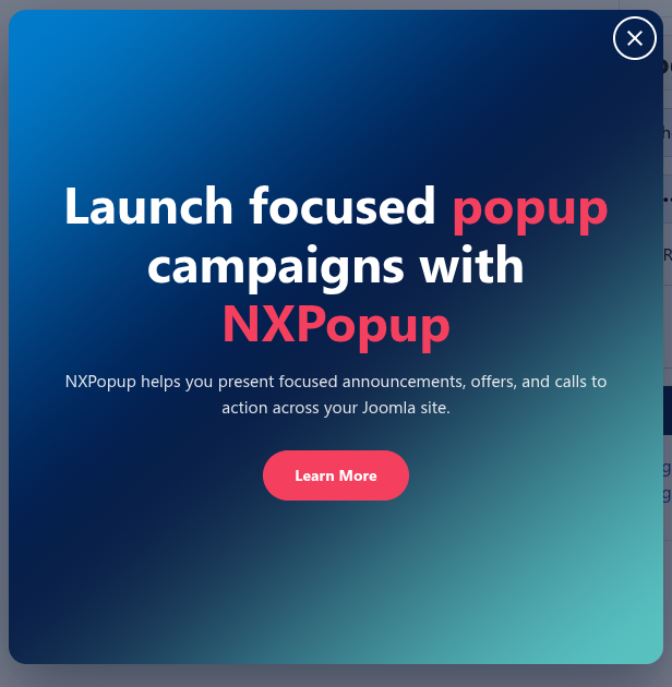
What's already handled
The module builds on the browser's native <dialog>
element opened with showModal(), which means the hard parts
come from the browser rather than from script that might not fire.
| Behavior | Why it matters |
|---|---|
| Focus is trapped inside while open | Keyboard users can't tab into the page behind |
| Escape always closes it | No keyboard trap, whatever your settings say |
| Focus returns to whatever opened it | The visitor doesn't lose their place |
| The dialog has an accessible name | Screen readers announce it rather than reading a blank box |
| Close button is 32 by 32 pixels | Above the 24 pixel minimum in WCAG 2.2 |
Close button is labeled Close |
The icon is hidden from assistive tech, so only the label is read |
| Focus rings on close and CTA | Visible keyboard focus, with an offset so it's not lost against the edge |
| Reduced motion is respected | Animation is skipped for visitors who ask for that |
Two details worth knowing because they look like bugs and aren't.
Nothing is focused when the popup opens.
showModal() would normally focus the first control, painting a
focus ring on the close button the moment it appears. Instead focus goes to
the popup frame itself. The dialog is still announced, no button is
pre-armed, and the first Tab press behaves normally.
Escape closes the popup even with Dismiss on Escape Key turned off. That setting only controls whether the dismissal is remembered, not whether Escape works. Escape closing is never optional.
Step 1: Give it a real title
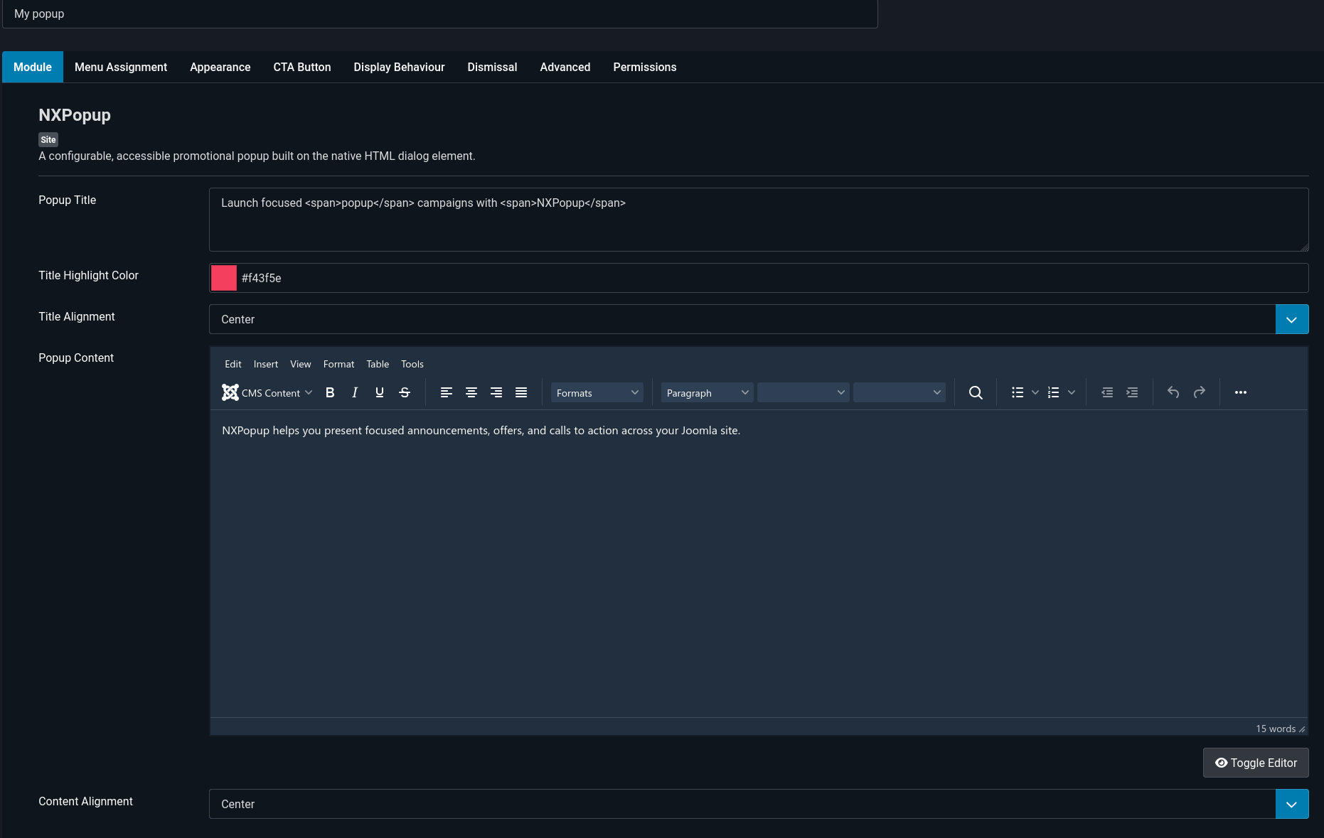
In the module settings, open the Content tab and fill in Popup Title.
The title becomes the dialog's accessible name, so a screen reader announces
your actual heading. Without one, the popup falls back to a generic
Notification, which passes a name check but tells the visitor
nothing.
Write a title that makes sense with no other context, since that's exactly
how it'll be heard: 10% off your first order rather than
Special offer!.
Step 2: Check your color contrast
This is the setting most likely to fail an audit, and the module can't check it for you.
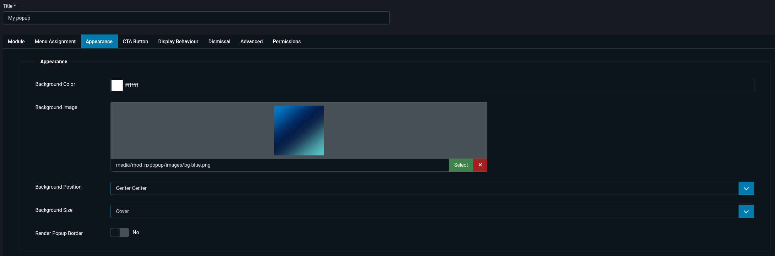
Under Appearance and CTA Button you can set Background Color, Title Highlight Color, Button Background Color, Button Text Color, and Button Border Color. Every one of them is free to produce something unreadable.
The thresholds you need:
| Element | Minimum ratio |
|---|---|
| Body text | 4.5 to 1 against its background |
| Large text, roughly 24px or 19px bold and above | 3 to 1 |
| Button borders and other UI boundaries | 3 to 1 |
Paste your chosen colors into any contrast checker before you save. Pale grey on white and white on light brand colors are the two that catch people out.
If you set a Background Image, check the text against the busiest part of the image, not the average.
Step 3: Write a CTA that stands alone
Under CTA Button, Button Text is read out
on its own when a screen reader user browses by links or buttons.
Click here and Read more are useless in that list.
Use the destination as the label: Browse the sale,
Book a demo, Download the guide.
If you set Button Target to open a new tab, say so in the
text or accept that the visitor gets a surprise. NXPopup adds
rel="noopener noreferrer" automatically, which is the security
half, but the warning is on you.
Step 4: Leave motion alone
The popup animates in and out, and skips that animation entirely for visitors whose system asks for reduced motion. Both the styling and the closing logic check for it, so there's no half-animated state.
You don't need to configure anything. Just avoid adding your own animation on top through custom CSS, because that layer won't check the preference.
Step 5: Test it with a keyboard
Five minutes, no tools needed. Open the page and put the mouse away.
- Wait for the popup to open. Press Tab. A visible ring should appear on the first control.
- Keep tabbing. Focus should cycle inside the popup and never reach the page behind it.
- Press Escape. The popup should close.
- Look at where focus went. It should be back on whatever you were on before, not at the top of the page.
- Reopen and close it with the close button instead. Same result.
If steps 2 to 4 pass, you've cleared the findings that sink most popups.
Step 6: Test it with a screen reader
Use whatever is on your machine. VoiceOver on macOS with Cmd+F5, or NVDA on Windows, which is free.
Trigger the popup and listen. You should hear it announced as a dialog, with
your title as its name, followed by the content. Then check that the close
button is announced as Close and not as button or
a filename.
That's the whole test. If your title is announced, you're in good shape.
Being reasonable about interruption
Accessibility isn't only what a checker measures.
Under Display Behaviour, Open Trigger offers After a delay, After scrolling, and On exit intent. Under Dismissal, Dismissal Period (days) controls how long a dismissal is remembered.
Some judgment calls that keep people on your side:
- Give visitors a moment before interrupting. Opening instantly, before the page has settled, is disorienting for everyone and worse for someone using a screen reader.
- Respect a dismissal for a real length of time. A popup that returns on the next page view reads as broken.
- Use Show After N Page Views so first-time visitors get to see your site before being asked for anything.
The popup never closes itself on a timer, which is deliberate. A dialog that vanishes while someone is still reading it is its own accessibility problem.
If an audit flags something
- "Dialog has no accessible name."
- Popup Title is empty and something is interfering with the fallback label. Set a title.
- "Insufficient color contrast."
- Almost always the CTA button or title highlight. See Step 2.
- "Content is not announced."
- The popup has a title but no content, so there's nothing for the description to point at. That's expected for a title-only popup and is not a real failure.
- "Focus is not visible."
-
Something in your template's CSS is overriding the focus ring. Search
your template for
outline: noneand remove it. - "Target size too small."
- Not the close button, which is 32 pixels. Check links inside your popup content.
- "Images missing alt text."
- Content you pasted in. The popup body is your HTML, so alt attributes are yours to add.
Full documentation: NXPopup.